Sunday 10 November 2013

Tuesday 5 November 2013

Heavy Assault Rifle - Zbrush


This is a SciFi themed weapon I've been working on, I'm in the process of doing the lowpoly version of it at the moment but I felt like uploading the highpoly model I created in Zbrush.
Two magazines has got to be better than one right?

Monday 14 October 2013

MG-42 Project Finished

This is the lowpoly model of the MG-42 I posted earlier. It has 1.972 tris (small triangles) and the textures are 1024px.

The project has gone quite well and I'm pretty happy with the result. There are some issues that I've not managed to solve but most are fixed. These images are taken from the viewport in 3ds Max with the Xoliul shader.

Saturday 5 October 2013

MG 42 Zbrush Project WIP


This is the Zbrush model I've made for a formative at school. It's not 100% complete yet as I still need to do a lowpoly version and the textures but I'm done with the highpoly :D

So far I have spent around 20 hours modeling it, although a lot of that time was spent learning the ins and outs of Zbrush which I've not had much experience working with before.


Saturday 28 September 2013

Sci-Fi Screen with LODs


This is the front of the screen setup. Yes, it's supposed to be grainy like that. This is the highest LOD with 2,5k tris and 1024px textures

Saturday 1 June 2013

Archer Artillery System Sketchfab

This is an update to the post I made before about the Archer Artillery System. I've now uploaded it to Sketchfab and you can view it in 3d :D

Friday 24 May 2013

Summative GA1A01 - T-rex skull


This is a Tyrannosaurus Rex skull I made for fun, it's drawn after a skull from Cleveland Museum of Natural History.

The proportions are for the most part right except for the ridge along the top of the skull, I've drawn it thinker than it was on the reference image.

I'm happy with how the lighting and details turned out, I've not even added half of the stuff that was on the original but I find those tiny details to be really hard to make justice when I drew this picture. The back of the skull is the area that got the least amount of attention and it shows, the top of the skull lacks a lot of details and is to "smooth" in general.

I tried to get better at adding detail and rendering, I find rendering fun as it makes the image "pop" and the details are fun when they are finished but are annoying to add.

Thursday 23 May 2013

Summative GA1A01 - Sitting Down


This is a more recent drawing (16-05-2013) that I made for one of the Lifedrawing summatives.

I'm happy with the shading but his back looks much thinner than it actually was, it's because of the reflections of the wall bouncing off of his ribs but I'm not sure how to change it without removing the reflections altogether.

His thigh muscles and shoulder are the things I'm most happy with, you can see the thigh muscles without them being too pronounced like the muscles on the lower leg which I'm not happy with.

He is sitting on a stool even though I didn't draw it, his feet are not glued to the ground.

Summative GA1A01 - Coloured Fruit

Coloured Fruit

I made this drawing last year (2012) during the time when we still had Traditional art instead of Lifedrawing.

This is probably the third drawing I made in colour during the Traditional art we had in the old classroom (the one that was in the same building but not accessible by the same elevators, it was past the kindergarten).

It is one of the few coloured drawings I've made, most of them are made by pencil, and I feel like I got the colouring sort of right. The reflections on the fruit look believable but the shadows might be a bit too weak.

It is made in one sitting and the colour we were supplied was not the best but I feel like it is worthy of being in the portfolio just to show that I can do more than just grayscale images.

Summative GA1A01 - Self-Portrait


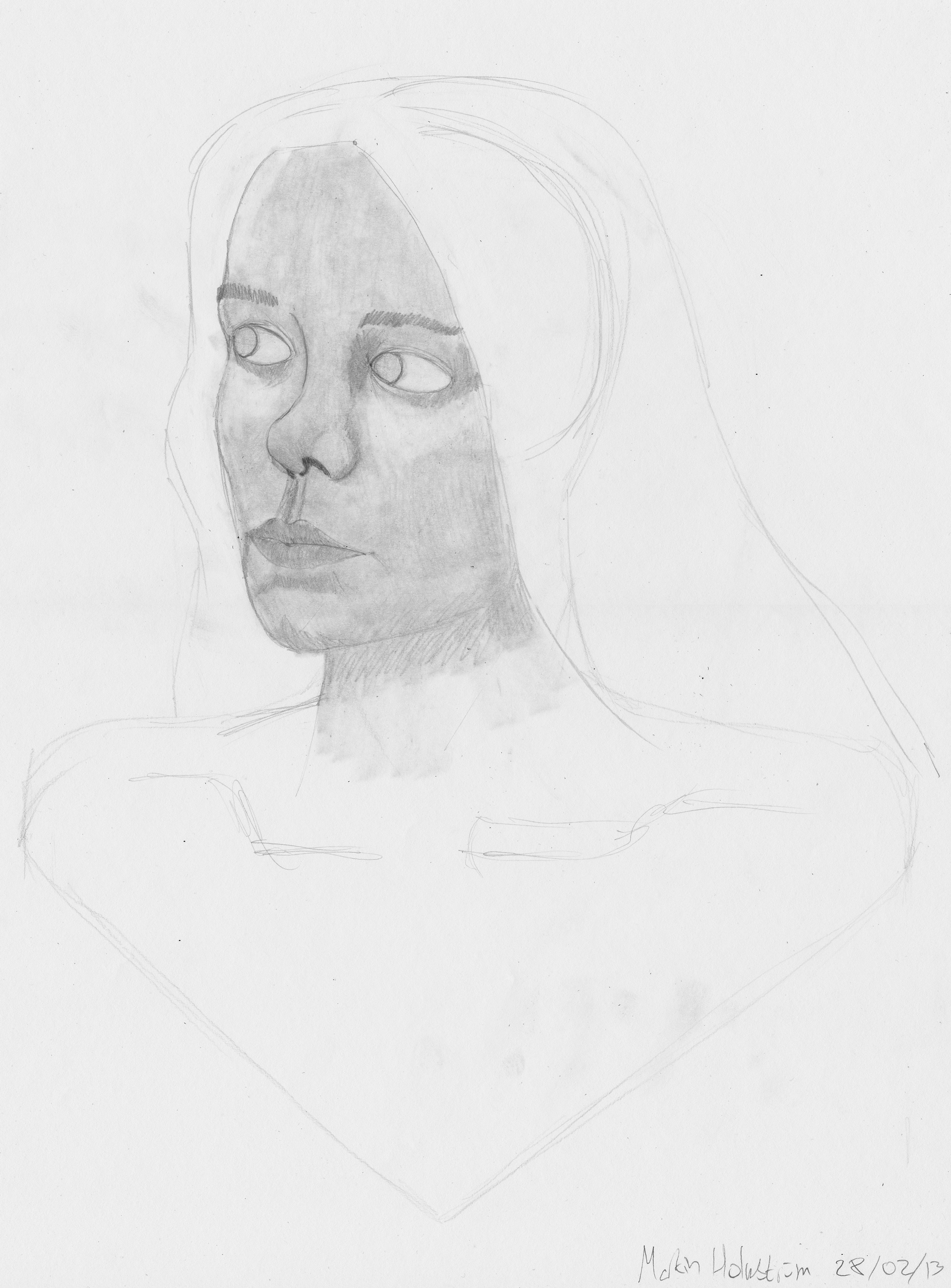
I chose this picture for my portfolio as it is the best self-portrait I've ever done, It's the best portrait of any kind that I've done for that matter.

Overall I'm really happy with how the portrait turned out, the shading and eyes are the features I'm most satisfied with as the eyes are almost lifelike.

Some critique for this is that the eye on the right has a larger "ring" around it, the neck is too long, the face is too "squished", it should be thinner and longer.

What I tried to achieve with this picture is to practice and get better at drawing faces and humans. I have difficulties drawing humans and living things in general but I feel like I've atleast partially overcome that with this portrait. I wouldn't say that it looks realistic, because it doesn't, but what it does look like is believable and that's great.

Summative GA1A01 - Lateral Portrait


This is a portrait of one of the models we have had during the life drawing lectures. It's drawn from the lateral view and I chose this one as I'm really happy with how it turned out.

I'm very happy with the shading and the form of the portrait. There are a lot of things that could have been better, the portrait feels a bit too "smooth" to be realistic and neither the hair nor is the neck upper torso drawn at all.

I feel like I can draw portrait from the side as you don't have to take the symmetry into account. I'll have to practice more with drawing portraits from the anterior view.

Summative GA1A01 - Quick Portrait


This is a portrait of our life drawing lecturer Reg.
I chose this as one of the pictures for the portfolio as I feel like it's a great picture for being made by me in around 5-10 minutes (I don't know exactly) during one of our lectures.

The proportions are a bit off and the rendering is made really quickly. The mouth is angled wrong and the hair isn't even drawn.

The thing I tried to accomplish with this is to get faster at drawing, having a short timeframe to draw the picture is a real challenge. I feel like I need to try to get faster with getting the features right and this picture is a big step forward.

Monday 4 March 2013

Self Portrait


This is a self portrait I've worked on during last week.
I'm not sure why there is a black line going across the image but it has something to do with the scanner as it is not on the paper (I'm scanning the original A3 paper in two halves and then stitching them together in photoshop).

The proportions are almost correct, the face should be thinner and a bit longer I think and the eyes are too far apart. Other than that I think it looks quite right, the hair did not get much attention and therefore isn't as detailed as it could have been.

As with the previous post I've worked a lot more with rendering than I'm used to but I'm getting better at it :D

Thursday 28 February 2013

Portraits


Portraits from the life-drawing class today.
I tried to work more with shading than what I've done before.
The second drawing is a bit odd and the proportions are off, I did not have enough time to finish the rendering either.
I'm having problems with drawing faces from the anterior view but I'm getting better at it.

Tuesday 12 February 2013

Wood-Burning Stove


This is a <300 poly model made in 3ds Max of a wood-burning stove.
The model was for training with normal, specular and diffuse maps using Photoshop and CrazyBump.

I'm happy with how the normal, specular and diffuse maps turned out, I've not worked with normal maps before but it wasn't that difficult once you got the hang of how it actually works.

I had trouble with adding detail to the model and I feel like I should have made something more suitable for the task and not something this simple.

Phantom Lancer


A picture I made in photoshop depicting a hero from Dota II (http://www.dota2.com/hero/Phantom_Lancer/).
I'm fairly satisfied with how it turned out and I focused mostly on shading. I used a "new" way with a solid-colour layer and an overlay layer with 10% opacity brush.

I could have added more details like scratches on the armour and the skin of the character.